findocblog

Category: Other

  • How to Read Intraday Candlestick Chart Patterns?

    How to Read Intraday Candlestick Chart Patterns?

    How to Read Intraday Candlestick Chart Patterns?

    Intraday analysis requires timely, structured information on price movements. Intraday candlestick patterns provide this by presenting market activity in a clear visual format, showing how prices fluctuate within shorter time intervals. These formations help illustrate shifts in buying and selling pressure throughout the trading day and are an essential part of technical analysis. Findoc explains these concepts in a systematic and accessible manner, enabling readers to understand how intraday patterns contribute to short-term market analysis.

    For beginners looking to participate actively in the markets, learning these patterns becomes even more valuable once they open demat account online, as it helps them make informed intraday decisions from day one.

    What Are Intraday Trading Chart Patterns?

    Intraday trading chart patterns are recognisable formations created by candlesticks on a price chart, showing how the market behaves within shorter time intervals. These patterns reflect shifts in buying and selling activity and help present intraday movement in an organised visual structure.

    Every candlestick shows four things for that time period:

    • Opening price
    • Closing price
    • Highest price
    • Lowest price

    When many candles are viewed together, they form identifiable intraday chart patterns. These patterns help in analysing short-term market behaviour and understanding how price movement develops during the trading day.

    Also Read: What is Intraday Trading?

    Common Intraday Chart Patterns

    Intraday chart patterns are recurring candlestick formations observed on short-term price charts. These patterns help analyse how market sentiment evolves during the trading day and offer a structured way to study intraday movement. Individual candles provide immediate price information; multi-candle formations give a broader view of short-term behaviour. Intraday patterns are generally grouped into bullish reversal, bearish reversal and continuation patterns.

    Bullish Patterns

    Bullish patterns suggest that downward momentum may be slowing and that buyers are becoming more active within the intraday timeframe. Common examples include:

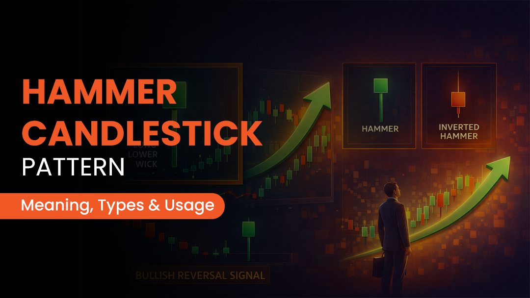
    • Hammer: A candle with a small real body and a long lower shadow, indicating that prices moved lower during the period but later recovered.
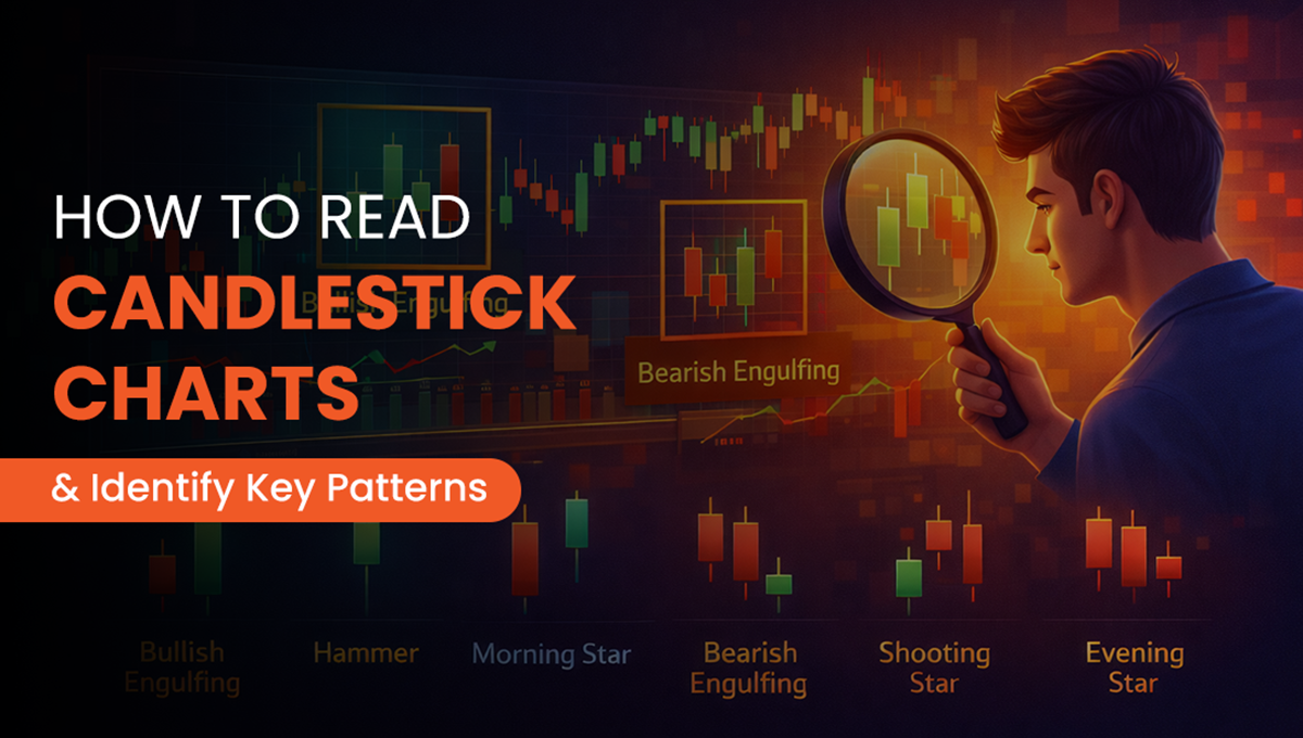
    • Bullish Engulfing: A larger green candle covers the previous red candle, reflecting a shift in intraday sentiment toward buying pressure.
    • Morning Star: A three-candle formation that appears after a decline, showing a transition from selling pressure to signs of renewed demand.

    Bearish Patterns

    Bearish patterns signal that upward momentum may be weakening and that sellers are beginning to exert more influence on the intraday chart.

    • Hanging Man: Visually similar to a hammer but appears after an upward movement, indicating intraday selling interest at higher levels.
    • Bearish Engulfing: A red candle that completely covers the previous green candle; this reflects increased selling activity within the session.
    • Evening Star: A three-candle pattern that appears after an upmove and reflects a shift from buying strength to emerging selling pressure.

    Continuation Patterns

    This pattern shows that the prevailing intraday trend may remain the same, subject to confirmation from subsequent candles.

    • Doji: A candle with minimal body, this represents indecision. When aligned with the broader context, it may support continuation once the next candle confirms direction.
    • Three White Soldiers: Three consecutive green candles with progressively higher closes, representing sustained intraday buying interest.
    • Three Black Crows: Three successive red candles that close lower each time, reflecting consistent intraday selling momentum.

    Additional Read: How to Start Online Trading?

    Key Components of a Candlestick Chart

    An intraday candlestick chart represents intraday price movement through a set of clearly defined elements. Each candle provides information about how prices behaved within a specific interval. The main components are as follows:

    1. The Real Body

    The real body reflects the difference between the opening and closing prices for the chosen time period.

    • A green body indicates a close above the open.
    • A red body indicates a close below the open.

    The size of the body shows the extent of buying or selling within that interval.

    2. The Wick or Shadow

    The wicks extend above and below the real body and mark the highest and lowest prices reached during the session.

    • The upper wick represents the intraday high.
    • The lower wick represents the intraday low.

    These ranges offer insight into price fluctuations beyond the open and close.

    3. Candle Extremes

    The top and bottom of the candle highlight the key price points for the interval.

    • In a green candle, the bottom of the body marks the open and the top marks the close.
    • In a red candle, the top of the body marks the open and the bottom marks the close.

    These levels help outline the path price has taken within the period.

    4. The Trend

    A sequence of candles forms visible trends on an intraday chart. Several consecutive green candles may indicate sustained buying interest, while repeated red candles may reflect ongoing selling pressure. Trend direction offers essential context when assessing intraday movement.

    5. Pattern Formation

    Patterns emerge in the chart when multiple candles appear in a specific pattern. Their collective structure helps identify reversal or continuation tendencies on an intraday trading chart. Multi-candle formations often provide broader insight than individual candles viewed in isolation.

    You May Also Like: Best Intraday Indicators to Improve Your Trading Strategy

    Steps to Apply Candlestick Patterns in Intraday Trading

    Applying intraday candlestick patterns in trading involves a structured analysis of market conditions rather than just relying on any single formation. The following steps show how these patterns are typically assessed within short-term price analysis

    1. Identify the Market Environment

    Determine whether the price is moving upward, downward, or within a narrow range. Candlestick patterns are more helpful when they are used in the context of an existing trend.

    2. Observe Relevant Patterns

    A sequence of candles is analysed to identify whether any recognised pattern is developing. The surrounding price action helps determine whether the formation aligns with prevailing market conditions.

    3. Refer to Technical Reference Points

    Use tools such as support and resistance levels, moving averages, or volume indicators to better understand market conditions. These references help validate whether the observed pattern aligns with broader market behaviour.

    4. Define Entry and Exit Zones

    Identify the areas on the chart where participation may occur and where positions can be closed. These zones are usually determined by technical levels instead of isolated candles.

    5. Apply Stop-Loss Measures

    Stop-loss levels are essential for effectively managing potential losses. They establish specific points at which a position is deemed no longer valid from a technical standpoint.

    6. Maintain Risk Parameters

    It is advisable to limit exposure to a small percentage of available capital. Implementing a consistent risk management framework is essential for mitigating the potential for disproportionate losses during periods of intraday volatility.

    Also Read: Understanding Trading, Profit and Loss Account

    Conclusion

    Intraday candlestick chart patterns offer a structured way to observe short-term market movement and identify how buying and selling activity develops within the trading day. These formations help present price behaviour in a clear visual format and support a more organised approach to analysing intraday trends. When assessed with confirmation and broader market context, they contribute meaningfully to technical interpretation. Findoc explains these concepts concisely and systematically, enabling readers to understand how intraday patterns fit into overall market analysis.

    Frequently Asked Questions

    The colour of the next candlestick cannot be predicted with certainty. Market participants analyse price structure, support and resistance levels, volume behaviour, and overall trend context to assess potential direction, but outcomes remain probabilistic rather than guaranteed.

    The 3-candle rule involves observing three consecutive candles moving in the same direction before evaluating short-term momentum. This approach helps reduce reliance on isolated candles that may not accurately reflect broader price behaviour.

    Patterns such as Hammer, Engulfing formations, Doji variations, and Morning Star structures are frequently used in intraday analysis. Their effectiveness depends on confirmation, volume support, and alignment with the prevailing market trend.

    The 3-5-7 rule refers to analysing price behaviour over groups of three, five, or seven candles. These groupings help identify short-term momentum shifts and provide a structured way to observe whether strength or weakness is developing in the market.

    The 1% rule is a risk management guideline that limits exposure on a single position to no more than 1% of total trading capital. Its objective is to control downside risk and support long-term consistency.

    Intraday trading carries higher risk due to rapid price movements within short timeframes. Beginners may find these fluctuations challenging without sufficient preparation. A disciplined approach, risk control, and structured analysis are essential in such environments.

    Candlestick patterns tend to be more reliable in stocks with higher liquidity and trading volume. In low-volume stocks, price movements can be erratic, making pattern-based analysis less consistent.

  • Candlestick Patterns Every Trader Should Know

    Candlestick Patterns Every Trader Should Know

    A candlestick chart is one of the most widely used tools in technical analysis, offering a clear view of market behaviour across specific time intervals. The formations on these charts are known as candlestick patterns, which help traders assess buying and selling pressure, momentum shifts, and short-term sentiment. Many beginners start learning these patterns soon after they open free demat account online, as it helps them analyse market movements more confidently. Findoc explains these patterns in a structured and accessible manner, helping readers understand their role in market analysis more effectively.

    What are Candlestick Patterns?

    Candlestick patterns are formations that appear on a candlestick chart and represent the price movement of a security within a specific period. Each candle shows four key data points: the opening price, the closing price, the highest price, and the lowest price. When multiple candles form recognisable structures, they may indicate potential shifts in market sentiment. These classifications help traders interpret how different candlestick chart patterns reflect shifts in sentiment and short-term market behaviour.

    Types of Candlestick Patterns

    Candlestick patterns are commonly grouped into bullish reversal, bearish reversal, and continuation patterns. Each category helps traders determine whether the market may reverse or continue its current movement. Understanding these classifications helps readers see how different candlestick formations reflect shifts in sentiment and potential short-term market behaviour.

    Some commonly observed candlestick patterns include:

    1. Bullish Engulfing Pattern

    A Bullish Engulfing pattern forms when a small red candle is followed by a larger green candle that fully covers the previous candle. It indicates a shift from selling pressure to stronger buying interest. This pattern often appears after a decline and may suggest improving sentiment in the near term.

    2. Hammer Pattern

    The Hammer is a single candle with a small body and a long lower shadow, typically appearing after a downtrend. It shows that sellers initially pushed the price lower, but buyers entered at those levels and restored it closer to the open. This may indicate emerging buying interest.

    3. Morning Star Pattern

    The Morning Star is a three-candle pattern that consists of a long red candle, a small indecisive candle, and a long green candle. It reflects weakening selling momentum and early signs of buying interest. This pattern may signal a shift in sentiment following a downtrend.

    4. Piercing Line Pattern

    The Piercing Line is a two-candle formation where a long red candle is followed by a green candle that closes above the midpoint of the previous body. It highlights increased buying participation after a decline and may point to a short-term improvement in sentiment.

    5. Bullish Harami Pattern

    This pattern appears when a large red candle is followed by a smaller green candle positioned within the previous body. It suggests a slowdown in selling momentum and the possibility of buying interest emerging, often observed during early signs of trend exhaustion.

    6. Three White Soldiers Pattern

    Three consecutive green candles of progressively higher closes form this pattern. Each candle opens within the prior body and closes near its high. It illustrates consistent buying interest over three sessions.

    7. Inverted Hammer Pattern

    The Inverted Hammer features a small body with a long upper wick and appears after a downtrend. It indicates that buyers attempted to lift prices despite earlier selling. While not a confirmation on its own, it can signal early buyer interest at lower levels.

    8. Dragonfly Doji

    A Dragonfly Doji has little to no body and a long lower wick, showing that sellers pushed prices down but buyers later restored them to the opening level. When seen after a decline, it may reflect buying interest emerging at key support levels.

    9. Bullish Abandoned Baby Pattern

    This pattern consists of a long red candle, a Doji that gaps down, and a long green candle that gaps up. The separation between the candles suggests a sharp change in sentiment. It is often interpreted as a potential bullish reversal when appearing after a decline.

    10. Three Inside Up Pattern

    The pattern begins with a long red candle, followed by a smaller green candle closing above the midpoint of the prior body, and concludes with a stronger green candle. It reflects a gradual transition from selling pressure to increasing buying interest.

    11. Three Outside Up Pattern

    This pattern begins with a red candle, followed by a larger green candle that engulfs the previous body, and a second green candle that closes higher. The sequence indicates strengthening buying interest and confirms a shift in sentiment after a decline. It is generally viewed as a reinforcing bullish signal.

    12. Bullish Kicker Pattern

    A Bullish Kicker pattern appears when a red candle is followed by a green candle that opens significantly higher, creating a noticeable price gap. This reflects a sharp change in sentiment, often driven by new information or strong buying interest. It is regarded as a decisive change in direction.

    13. Tweezer Bottom Pattern

    This pattern forms when two consecutive candles display nearly identical low points. It suggests that the market has tested a support level twice and rejected lower prices both times. The formation indicates stabilising sentiment and the possibility of buying interest at that level.

    14. Rising Three Methods Pattern

    This continuation pattern features a strong green candle, followed by a series of small red candles that remain within its range, and ends with another green candle closing higher. It reflects a temporary pause in an uptrend before buyers regain control. The structure suggests sustained upward momentum.

    15. Bearish Engulfing Pattern

    A Bearish Engulfing pattern forms when a small green candle is followed by a larger red candle that completely covers the previous body. It indicates increasing selling pressure and a potential sentiment shift after an upward move. It is often interpreted as a sign of weakening momentum.

    16. Bearish Belt Hold Pattern

    This pattern appears as a long red candle that opens at its high and closes near its low without forming an upper wick. It reflects strong selling interest from the start of the session and may indicate emerging downward pressure after an advance.

    17. Three Black Crows Pattern

    Three consecutive long red candles with small or no wicks create this pattern. Each candle opens within the prior body and closes lower. It signals sustained selling pressure and may indicate the early stages of a broader downward trend when seen after an upmove.

    18. Bearish Evening Star Pattern

    The Evening Star is a three-candle formation consisting of a strong green candle, a small indecisive candle, and a long red candle closing deep into the first candle’s body. It shows that upward momentum has weakened and that sellers are beginning to take control.

    19. Bearish Shooting Star Pattern

    A Shooting Star features a small body and a long upper wick and appears after an advance. It indicates that buyers attempted to push prices higher but were met with selling pressure. This shift may suggest early signs of weakening momentum near resistance.

    20. Bearish Harami Pattern

    This pattern forms when a large green candle is followed by a smaller red candle that sits within the prior body. It reflects slowing buying interest and indicates increasing selling interest. The formation may indicate hesitation in the ongoing uptrend.

    21. Bearish Kicker Pattern

    A Bearish Kicker consists of a strong green candle followed by a red candle that opens significantly lower, creating a clear downward gap. The abrupt price shift suggests a notable change in sentiment, often prompting a reassessment of the preceding trend.

    22. Bearish Tweezer Top Pattern

    This pattern occurs when two candles at the top of a trend share a similar high. The first is typically green, followed by a red candle. It suggests that the market encountered firm resistance at that level, indicating a potential shift towards selling pressure.

    23. Dark Cloud Cover Pattern

    The Dark Cloud Cover consists of a long green candle followed by a red candle that opens higher but closes below the midpoint of the previous body. It highlights rising selling interest and may indicate weakening momentum.

    Also Read: Stock Market Technical Analysis

    Conclusion

    Candlestick patterns offer valuable insight into short-term market behaviour by showing how the price reacts to buying and selling pressure. Understanding these formations helps traders interpret shifts in sentiment and assess potential movements within ongoing trends. Findoc presents these concepts in a structured and accessible manner, supporting readers as they develop a sharper understanding of the role these patterns play in informed market analysis.

    Frequently Asked Questions

    No single candlestick pattern is universally accurate. Patterns such as the Bullish or Bearish Engulfing are considered strong signals, but their usefulness increases when combined with trend analysis, volume, and broader market context.

    It refers to analysing three consecutive candles together to confirm a possible reversal or continuation. This approach helps traders avoid reacting to isolated candles and reduces the likelihood of misinterpreting short-term movements.

    Candlestick patterns can be used to identify potential reversals, continuations, entry areas, and exit points. They highlight changes in buying and selling pressure, but should be interpreted alongside technical indicators and risk-management principles.

    They are helpful tools for reading market behaviour, but they are not guarantees in and of themselves. Reliability improves when patterns are combined with supporting indicators, market structure, and broader analysis.

    Candlestick patterns are formations created by price movement on a candlestick chart. They help traders understand market sentiment and assess whether prices may strengthen, weaken, or consolidate based on recent activity.

  • Hammer Candlestick Patterns

    Hammer Candlestick Patterns

    Hammer Candlestick Patterns

    A hammer candlestick is a widely recognised chart formation used in technical analysis to interpret potential shifts in market sentiment. It appears after a decline and is characterised by a distinct structure, which may signal early signs of buying interest. Findoc explains such patterns clearly and in a structured manner to help readers understand their relevance in market analysis.

    Understanding such patterns becomes even more valuable for new investors who wish to make informed decisions when they open demat account online and start analysing market movements.

    What Is a Hammer Candlestick Pattern?

    A hammer candlestick pattern is a single-candle formation that commonly appears after a downward price move. It has a small real body and a long lower shadow, which indicates that prices have declined during the session but were later supported by buying interest. In the hammer in the stock market context, this structure reflects rejection of lower levels. While it may suggest improving sentiment, it should be assessed alongside broader market conditions and confirmation from subsequent price action.

    Also Read: Expert Stock Market Technical Analysis

    Importance of Hammer Candlestick Patterns

    A hammer pattern is important because it highlights price rejection at lower levels and may indicate a potential shift in market sentiment. Analysts often review the hammer candle to identify whether selling pressure is weakening and buying interest is emerging. When combined with confirmation from subsequent price movement, it can provide useful context within broader technical analysis.

    Additional Read: Fundamental Analysis in the Share Market

    Types of Hammer Candlestick

    Hammer formations appear after a decline and highlight rejection of lower prices, but their structures differ slightly. The two most recognised variations are the Bullish Hammer and the Inverted Hammer.

    1. Bullish Hammer

    A Bullish Hammer has a small real body positioned near the top of the candle and a long lower shadow. This structure shows that the price fell during the session, but buyers entered decisively at lower levels, pushing the price back toward the open. It is often viewed as an early indication that selling pressure may be weakening and that demand is beginning to emerge.

    2. Inverted Hammer

    An Inverted Hammer has a small body near the lower end of the candle and a long upper shadow. It forms after a downtrend and reflects an attempt by buyers to lift the price, even though sellers later drove it back near the open. If the candle that follows closes higher, it may support the view that buying interest is strengthening despite earlier downward momentum.

    Both variations suggest that lower levels have been tested and may indicate early signs of shifting sentiment, subject to further confirmation.

    Also Read: Types of Trading in the Stock Market

    Interpretation of Hammer Candlesticks

    Interpreting a hammer candlestick involves examining how the price moved during the session and what that movement suggests about market sentiment. The candle typically shows that prices opened, declined as sellers dominated early trading, and later recovered as buyers entered at lower levels, resulting in a close near the upper portion of the candle’s range.

    A hammer pattern is generally considered more meaningful when:

    • It forms after a series of preceding bearish candles
    • The candle that follows closes above the hammer’s high, offering confirmation
    • The lower shadow is significantly longer than the real body, indicating strong rejection of lower prices

    These factors collectively help assess whether selling pressure is weakening and whether buyers are beginning to show interest at lower levels. Findoc explains such pattern-based interpretations in a structured and accessible manner, helping readers understand how these signals fit into broader technical analysis.

    Also Read: What is Trading Account?

    Trading Strategies Based on Hammer Pattern

    The hammer pattern is often assessed alongside other technical factors to determine whether sentiment is shifting. Common approaches include:

    • Reviewing the candle that follows the hammer to check whether it closes higher, offering confirmation
    • Using established support levels to assess whether the rejection of lower prices aligns with the broader market structure
    • Considering volume behaviour to gauge the strength of buying interest at lower levels
    • Avoiding the interpretation of hammer formations that appear within sideways or low-momentum market conditions

    These considerations help place the hammer pattern within a broader framework of technical analysis.

    Additional Read: What is a Demat Account?

    How to Trade the Hammer Candlestick Pattern

    When analysing a hammer candlestick pattern, traders typically follow a structured approach to understand whether buying interest is emerging at lower levels. Key steps include:

    • Identifying the hammer at the end of a clear downtrend
    • Ensuring the lower shadow is significantly longer than the real body
    • Waiting for the next candle to close above the hammer’s high as confirmation
    • Considering trade entries only after confirmation is established
    • Placing a stop loss below the hammer’s low to manage risk
    • Setting potential targets based on nearby resistance zones or previous price levels

    These steps help integrate the hammer pattern into a disciplined technical analysis process.

    Additional Read: What Is Dematerialisation?

    Tips for Trading with Hammer Candlestick Pattern

    When evaluating a hammer candlestick pattern, the following considerations can help place the formation within a broader analytical context:

    • Look for confirmation from the subsequent candle to understand whether buying interest is strengthening
    • Review the proportion of the lower shadow to the real body, as deeper rejection may reflect stronger intraday demand
    • Use trendlines, moving averages, or broader trend structure to contextualise the pattern
    • Exercise caution with hammers that have relatively small shadows or appear in low-momentum market environments
    • Apply disciplined risk-management principles when interpreting any candlestick formation
    • Avoid relying solely on patterns without considering additional technical or market factors

    Also Read: What is Intraday Trading?

    Example of Hammer Candlestick Pattern

    For instance, if a stock declines over several sessions. One day, the stock opens at 100, drops to 90, but closes at 102. This structure forms a hammer candlestick, indicating rejection of lower prices. If the following session opens higher and closes above this level, buying interest is likely to strengthen after the earlier decline.

    Limitations of Hammer Candlestick Pattern

    While the hammer candlestick pattern is a useful analytical formation, it has certain limitations that should be considered:

    • A hammer does not indicate a reversal in every instance
    • Confirmation from the subsequent candle is generally required
    • The pattern may be less effective during strong or persistent downtrends
    • It does not indicate the duration or strength of any potential reversal
    • Additional technical tools are necessary to build a broader market view

    Findoc presents these considerations in a structured manner to help readers understand the context in which hammer formations may be interpreted more effectively.

    You May Also Like: What is Algo Trading?

    Common Mistakes While Using Hammer Candlestick Pattern

    When interpreting a hammer candlestick pattern, certain errors can affect the accuracy of the analysis. Common mistakes include:

    • Entering the trade before the pattern receives confirmation from the next candle
    • Interpreting hammer formations that appear in sideways or low-momentum market conditions
    • Relying solely on the hammer pattern without checking other technical indicators
    • Overlooking the proportion between the shadow and the real body
    • Placing stop-loss levels too close to the candle’s low may lead to premature exits

    Recognising these mistakes can help apply the hammer pattern within a more disciplined analytical framework.

    Recommended Read: What are Shares?

    Conclusion

    The hammer candlestick pattern is a trusted technical analysis formation that shows rejection of lower prices and may signal early signs of shifting sentiment after a downtrend. Its effectiveness improves when evaluated in conjunction with confirmation and a wider market context. Findoc presents these concepts in a clear, structured manner, enabling readers to understand how individual patterns contribute to overall chart interpretation.

    Frequently Asked Questions

    A hammer candlestick pattern is a single candle with a small body and a long lower shadow. It forms when prices decline during a session, but recover significantly before the close, indicating rejection of lower levels.

    Its reliability improves when it appears after a downtrend and is supported by confirmation from the following candle. However, like all chart patterns, it should be assessed alongside broader market conditions.

    It is generally not used in isolation. The pattern is more meaningful when combined with additional indicators such as volume, trend structure, or established support levels.

    If the price does not show confirmation in the next session, the pattern remains inconclusive. In such situations, analysts usually avoid drawing conclusions based solely on the hammer.

    The pattern can appear across multiple timeframes. Many analysts refer to higher timeframes, such as hourly or daily charts, for clearer signals and reduced noise.

    Yes. The colour of the real body is less important than the presence of a long lower shadow, which indicates that lower prices were rejected during the session.

    Both candles look similar, but their context differs. A hammer forms at the bottom of a downtrend and is associated with potential bullish reversal, while a hanging man appears after an uptrend and may indicate emerging selling pressure.